National Museum
(New Delhi)
Reframing Cultural Heritage for a Modern Audience
A restrained identity system designed to modernize the National Museum of New Delhi while preserving its historical depth.
-
Role: Brand Designer
-
Scope: Identity, Typography System, Visual Language, Campaign
-
Year: 2022
-
Creative Direction: Academic Mentorship

The National Museum in New Delhi houses over 200,000 artifacts spanning more than 5,000 years of Indian history. It functions under the Ministry of Culture and serves as one of the country’s most significant cultural institutions.
Despite its scale and historical importance, its visual identity does not reflect its contemporary relevance or potential to engage modern audiences.

Why current identity doesn't work:
-
Visual Competition with Artifacts
-
Limited Flexibility Across Departments
-
Inconsistent Hierarchy
The Challenge
-
Modernize the museum’s identity without erasing tradition
-
Increase accessibility for younger and international audiences
-
Create a scalable system across print, environmental, and digital platforms
-
Ensure artifacts remain the focal point
Solution


Design Strategy
If the artifacts are detailed, the identity must be minimal.
If the history is complex, the system must be structured.
The identity acts as a frame, not the artwork.

Cultural Insight
Indian artifacts are visually intricate and ornament-heavy. A competing visual identity would create noise rather than clarity.

Institutional Insight
Leading global museums use restrained, confident systems that emphasize timelessness over decoration.
Concept Development
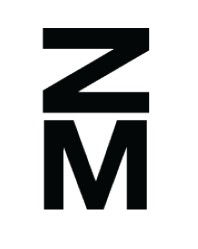
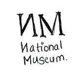
Early explorations began with literal interpretations of “NM.”
Through iteration, the mark evolved into an abstract geometric form.
The final symbol represents:
-
Architectural symmetry
-
Monumental stability
-
Modular scalability
-
Cultural permanence
Its sharp geometry references temple forms and stone carvings while remaining contemporary in execution.


Typography
Together, they mirror the museum’s duality:
Ancient heritage × Modern audience.
Color System
Black (#000000)
White (#FFFFFF)
The monochromatic palette
intentionally removes visual
competition from artifacts.
The system remains timeless,
adaptable, and institutionally authoritative.
Modular Pattern System
Derived directly from the logo, The pattern acts as a visual system that unifies spatial, print, and digital environments while maintaining restraint that lets artifacts take precedence. The repetition creates visual rhythm while reinforcing institutional recognition.


Exhibition Campaign: Jewels of India
The campaign demonstrates how the identity supports artifact-led storytelling.
High white space, restrained typography, and a dominant artifact create visual hierarchy without distraction.
The brand steps back.
The culture steps forward.


